← Back to blog
Motionlab Blog
SaaS Onboarding Videos: Activate Your Users Faster
Noa Tuloup
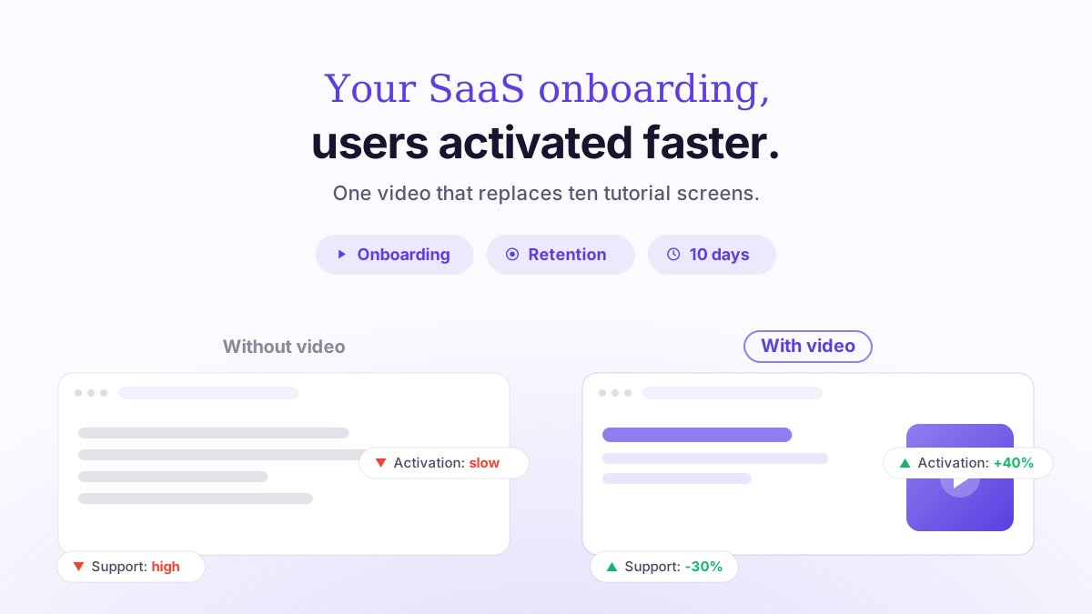
A SaaS onboarding video is a short animated sequence (often 30 to 90 seconds) that guides a new user to their first moment of value, the famous "aha moment", faster than a wall of text or a checklist. The stakes are clear: on most SaaS products, a large share of sign-ups never come back after the first week if they haven't reached a concrete value milestone. Placed well, an onboarding video shortens this critical delay, known as time-to-value, and supports your activation rate.
This article covers where to place these videos in the product journey, which formats work, how to break them down, and the mistakes that make users drop off. We're focusing on onboarding here: for the video that explains your product to a prospect who doesn't know your solution yet, see our dedicated article on explainer videos for SaaS.
Why video speeds up activation
The onboarding problem isn't ignorance, it's friction. A new user arrives with an intention, but every step they don't understand is another chance to give up. SaaS onboarding research consistently points the same way: on many products, a significant share of sign-ups never make it past the first week because they never got a concrete result, while the best-designed products deliver their first value in just a few minutes. That delay is exactly where activation is won or lost.
Video works on precisely this point. It compresses into a few seconds what text spreads across several screens, shows the interface in motion instead of describing it, and sets a clear expectation: "here's what you're going to get." It's the same underlying logic we explain in why motion design converts better than text: the brain processes an animated demonstration faster than a written instruction.
One caveat, though: video doesn't activate users on its own. It prepares the action, it doesn't replace it. A successful onboarding video always pushes toward a concrete step in the product, such as creating a first project, importing a file or inviting a colleague. That video + action pairing is what really moves the activation needle.
Where to place the video in the journey
There isn't "one" onboarding video, but several moments where a short sequence makes sense. Each one answers a different intent and calls for a different format.
1. The welcome screen
Right after sign-up, a 30 to 45 second video sets the scene: what the product does, the outcome it delivers, and the first action to take. The goal: ease the blank-screen paralysis and point users toward step 1.
2. The contextual video (in-app, triggered)
Micro-sequences of 10 to 20 seconds, silent and looping, that play when the user interacts with a specific feature. This is the logic of progressive disclosure: you only explain a feature when it becomes relevant, not all at once at the start.
3. The feature tutorial
A task-by-task video ("how to create an automation", "how to connect your CRM") of 45 to 90 seconds, available from the help center or triggered when the user gets stuck. It drives adoption beyond the first session.
4. The reactivation video
Sent by email to an inactive user, it highlights the value they haven't tapped into yet and brings them back into the product. Short format, benefit-driven, with a single CTA.
Formats and lengths: the decision table
The golden rule: one video, one goal. Industry guides agree that a series of short, modular videos (under 90 seconds each) outperforms a single long demo, because completion rates collapse as length goes up. Here's how to decide.
Moment | Target length | Format | Voiceover? | Goal |
|---|---|---|---|---|
Welcome screen | 30-45 sec | 16:9 or 1:1 | Yes | Frame the value + 1st action |
In-app contextual video | 10-20 sec | 1:1, looping | No (silent) | Explain a feature at the right moment |
Feature tutorial | 45-90 sec | 16:9 | Yes | Help users succeed at a specific task |
Reactivation email | 30-60 sec | 16:9 or 9:16 | Optional | Bring inactive users back |
Subtitles are make-or-break: many in-app videos are watched with the sound off, with no headphones, in an open-plan office. Contextual micro-sequences therefore need to make sense in silence, with burned-in subtitles and self-explanatory animation. For choosing dimensions based on where the video plays, our guide to 16:9, 1:1 and 9:16 formats covers each case.
Motion design or screen recording?
Many product teams start with a simple screencast: record the screen, add commentary. It's fast and cheap, but fragile. As soon as the interface changes (and a SaaS changes all the time), the video goes stale and lets users down with a UI that no longer matches.
Motion design strikes a different balance. By recreating the interface in an animated, stylized way, it ages better (you can update one screen without redoing everything), stays easy to read and carries your brand identity. It also lets you zoom in, annotate and slow down key gestures, which is impossible to do cleanly with a raw capture. For a broader comparison of the two approaches, see motion design vs. traditional video.
In practice, many products combine both: screencasts for low-stakes niche tutorials, motion design for the videos every new sign-up sees (welcome screen, key contextual sequences), where perceived quality matters most.
The script: build it around the aha moment
An onboarding video isn't an exhaustive guided tour. Its backbone is the first moment of value: the action after which the user thinks "OK, this thing is really going to help me." Everything else is secondary.
An effective structure has four beats: (1) the problem the user wants to solve, in one sentence; (2) the result they'll achieve; (3) the concrete action or actions to get there; (4) a single CTA toward that action. Resist the temptation to add features "while you're at it." Every extra feature dilutes the message and stretches the length, which lowers completion. The full method is detailed in how to write a motion design video script.
Five mistakes that make your users drop off
Explaining everything at once. A 3-minute video covering twelve features right at the start: nobody finishes it. Break it up and trigger each piece at the right moment.
Locking the product behind the video. A video you can't skip annoys users in a hurry. Always let them move on.
Relying on sound. An in-app sequence that makes no sense without audio loses a large part of its audience.
Forgetting the action. A beautiful video that doesn't push toward any concrete step informs but doesn't activate.
Never measuring. Without tracking completion rate and post-video activation, there's no way to know whether the sequence helps or hurts.
How much it costs and how long it takes
The budget depends mainly on length, style (2D or 3D) and the number of sequences. At Motionlab, a polished 60-second video usually falls between €3,000 and €4,500 excl. VAT in 2D motion design; a series of contextual micro-videos can share the same visual style, which lowers the cost per video. For a detailed breakdown of price ranges by format, see how much a motion design video costs in 2026, and for length, our guide to choosing between 30, 60 and 90 seconds.
FAQ
How long should a SaaS onboarding video be?
It depends on the moment: 10 to 20 seconds for an in-app contextual sequence, 30 to 45 seconds for a welcome screen, 45 to 90 seconds for a feature tutorial. Beyond 90 seconds, completion rates drop sharply.
Should you make one video or several?
Several. Industry guides show that a modular series (one video, one goal) outperforms a single long demo. Sharing the same visual style keeps the budget under control.
Motion design or screen recording for onboarding?
A screencast is fast but goes stale as soon as the UI changes. Motion design ages better, can be updated screen by screen and carries your brand, which matters most for the videos every new sign-up sees.
Does an onboarding video replace a checklist or a product tour?
No, it complements them. The video frames the value and the intent; the checklist and tooltips guide the action in the interface. The video + action pairing is what truly activates users.
How do you measure an onboarding video's effectiveness?
Three metrics: the video's completion rate, the activation rate of users who watched it versus those who didn't, and time-to-value (the time it takes to reach the first value milestone).
Can you reuse the onboarding video elsewhere?
Yes: a clip can feed a landing page, a reactivation email or a social post in 9:16 format. That's one of the benefits of a single visual style adapted into several formats.
What about Motionlab?
Motionlab is a French motion design agency based in Paris that specializes in working with SaaS companies and startups. We produce onboarding videos and series of contextual sequences designed for activation, delivered in 10 days with unlimited revisions, which comes in handy when your interface changes and the video needs to keep up.
Every project is handcrafted by qualified motion designers (nothing is AI-generated) and includes the script, storyboard, voiceover, licensed music and sound design. Videos are delivered in 16:9, 1:1 and 9:16 to cover the welcome screen, in-app and reactivation channels. Rated 4.9/5 across 44 reviews, with more than 65 clients served.
Take the next step
Want to shorten your time-to-value and activate new sign-ups faster? Let's talk about your onboarding journey and the sequences that will have the biggest impact. Book a free discovery call with Motionlab: free quote, no commitment.
Got a video project to figure out?
Let’s talk about your next video and find the right angle.
Talk about my project